
Unlike your grandpa, when webmasters say web design “just ain’t like it used to be”, they mean it in the best possible way. Technology and consumers have changed a lot even in the last decade. Successful business owners have recognized that their websites should advance with the times, not fall behind it. Consider using the following features to ensure your website has the best modern web design to stand out from the competition.
1. Sliders are not present.
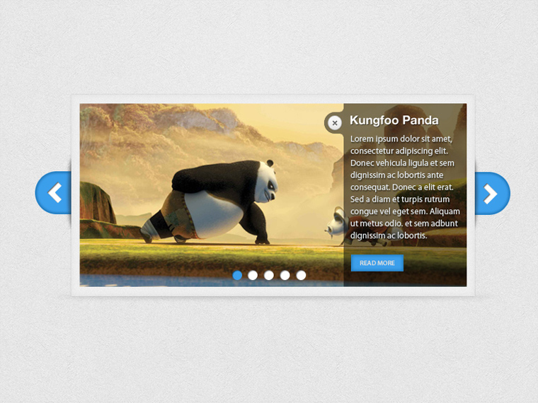
The homepage slider has been phasing out for some time now. This becomes apparent just be searching ‘homepage sliders’ in Google.. The first result is ‘Why Sliders Make Your Website Suck’.
For most businesses that use sliders, their most important offers and content are placed here. What if we were to tell you that hardly anyone clicks or reads the information in sliders?
See the results below of a study by a developer at Notre Dame University that shows how many people clicked on images/offers according to their position in the website’s slider (don’t zone out yet, we won’t get too in-depth).

It clearly shows that users click the first image and are unlikely to click through to other offers in the slider.
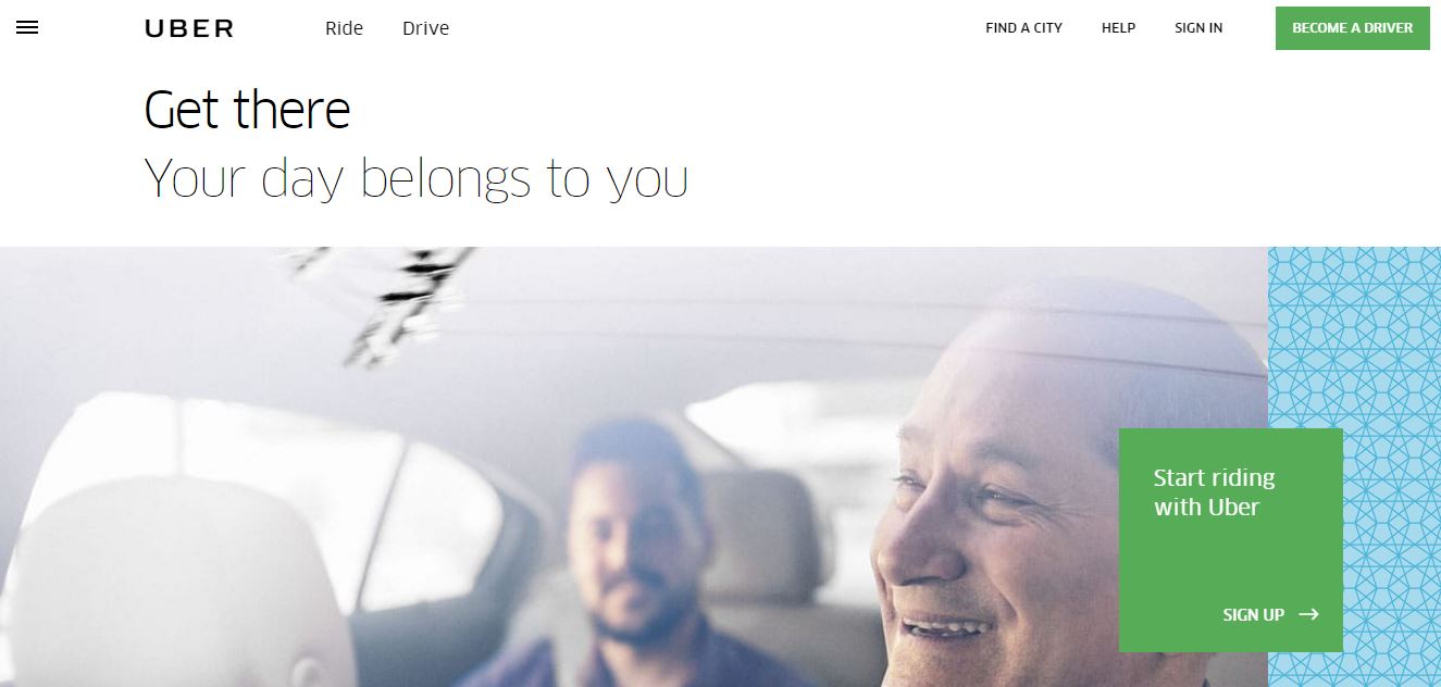
2. Calls-to-Action are placed strategically.
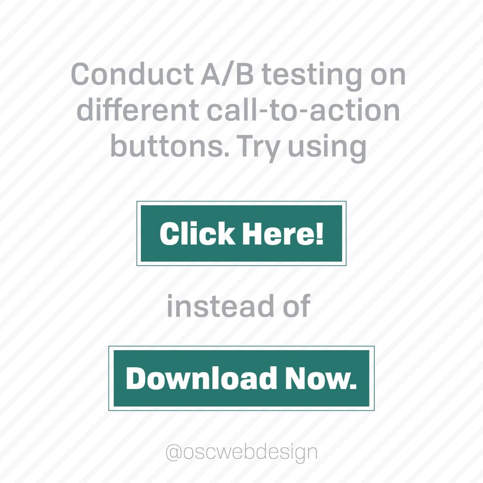
We strongly advise each of our clients to ditch sliders for a single CTA (Calls-To-Action). A CTA presents a clear path for the visitor to take and is much less distracting.
Besides placing a CTA above the fold (the first thing visitors see when they land on your homepage) you can place them in strategic places throughout the rest of your site. CTAs are used to encourage users to take the next step towards your goal.
Your main goal is probably to get website visitors to make a purchase or contact your business. This is called a macro conversion.
Goals that lead up to this, like downloading a whitepaper or signing up for your newsletter, are called micro conversions.
Your website’s above the fold space is valuable website real estate – use this for a call-to-action or clear content.
3. Large homepage images- less text.
Images are more appealing to users and encourage them to continue down the page. Think of your homepage like a picture book. The text that is used is emphasized, clear and short.
You may be tempted to elaborate on each of your services on the homepage.. That’s why you have a services page. You can briefly mention them but shoot for as little words as possible.
4. Search engine optimized.
The main concern of anyone with a website is attracting more visitors. Besides referral traffic from social media and other websites, search engines are really the only way to be discovered.
Ranking higher in popular engines like Google means that your website is gaining much sought after exposure. While SEO is technically a marketing service, we believe web designers should have an understanding of it as well. That way, your website will be built on a foundation of SEO best practices.
When your web designer runs an SEO audit, a report is generated of which keywords are related to your website, how popular they are, and the amount of competition. By using the right keywords in specific website headers and text areas, Google spiders (the robots that investigate each website and help rank) will read your relevancy. To learn more, check out our beginner’s guide to SEO for small businesses.
5. Responsive design.
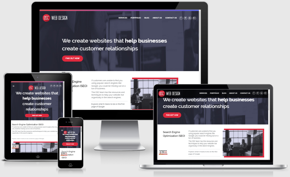
It’s hard to believe there are still non-responsive web designs out there, but guess what? 46% of people using mobile devices report having problems viewing a static site. A static site is a traditional, non-responsive website.

When your website isn’t responsive, it means users on mobile and tablet devices may not be able to view your website or the design looks “off”. With an huge increase in mobile use, it is crucial to choose a responsive design.
6. Brand inspired.
What makes your brand unique? Your website is your business’s online brochure, it’s important that the design is consistent with marketing and branding efforts.
Every design element should flow smoothly and make sense. If your logo is outdated, perhaps it’s time for a redesign. Use the colors, font, and style to inspire the rest of the website.
7. Always improving.
Maybe you’ve conducted A/B testing, defined your personas, and every bit of your web design is modern. That means it will retain an optimal conversion rate for the rest of time, right?
If only that were so. Website design, consumers, and the web itself will continue advancing and changing. Features of the best modern web design in 2017, probably won’t be relevant in years to come.
To keep your web design converting, consider an approach like growth-driven design (GDD) which involves updates throughout the year.
Next time Grandpa starts saying something “just ain’t like it used to be”, put his hands on a keyboard and get him a domain. He’ll thank you for modern web design later when worldwide readers are hanging on his every word.


