
While low prices and great products are a big part of eCommerce, an effective design can mean the difference between users sticking around and users making a beeline to the “back” button. Not only are cluttered, poor designs frustrating, they can cause distrust. With all the spammy websites out there, shoppers want to feel like they are giving their personal information to a credible business. Does your eCommerce site have the following qualities?
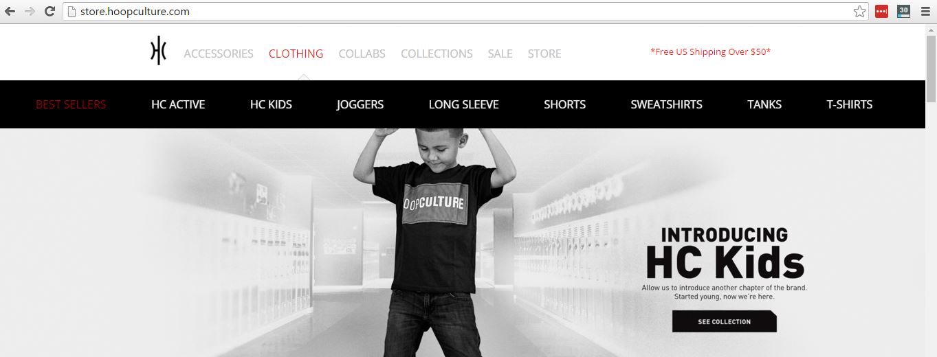
1. User-Friendly Product Selection
Think of how you expect to navigate brick and mortar stores. If there was one shelf piled with every product in the store, you would probably go elsewhere rather than rummaging through. When eCommerce stores have one drop down menu listing an overwhelming number of products, this has the same effect on shoppers. Ensure items are organized in a clear and logical way. To figure out if your organization makes sense to visitors, conduct testing and take a look at the data. Growth driven design is the best tactic for improving usability over time.
2. Promotions
 Who doesn’t like promotions? These are a great way to set your business apart from the others. If your competition has similar prices or even lower, free shipping or discounts can make shoppers still feel like they are getting a better deal. Make sure to prominently display all limited time offers and use them as an incentive.
3. Evident Live Chat Box
For some, the idea of a pop-up chat box sounds spammy. The facts speak for themselves though.
77% of consumers want to contact a real person before buying, and more than half say a lack of interaction has caused them to stop a purchase.
44% of online shoppers say that having a live person to answer questions during their purchase is one of the most important features on an eCommerce website.
Your visitors want convenient and fast responses. A chat box shows that you are ready to help and that they won’t have to delay their purchase to search for a long 1-800 number.
4. Currency Options
If your business caters to multiple locations and currencies, it’s important to have these options displayed prominently when shoppers are viewing your products. Viewing items in the wrong currency is a big turn off. Users often assume you do not ship to their location or are annoyed at having to make conversions in their heads. Instead of calculating or waiting to see the conversion applied in their cart, many shoppers will avoid the hassle and jump to another site.
5. Easy Display Options
Fancy graphics and animations are great in the right context. As far as shopping goes, let the product images speak for themselves. Consumers only want to see what’s relevant to the items they’re shopping for and anything beyond that is distracting and increases page load times. Since price is a priority for many shoppers, a simple drop down menu to sort search results is a must.
6. Straightforward CTA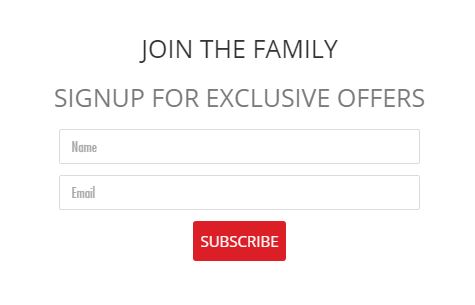
You are much more likely to receive submissions with a simple call to action/sign up form. A promise of discounts and offers is an appealing option. One of the most effective ways to keep visitors scrolling right past your CTA is multiple, long requests for their information. As with many cases in online usability, the easier, the better.
7. Clean Navigation Bar
Never underestimate the power of white space! If visitors don’t promptly find what they’re looking for, they usually won’t stick around long. Use straight to the point navigation and leave decorative designs for your media page.
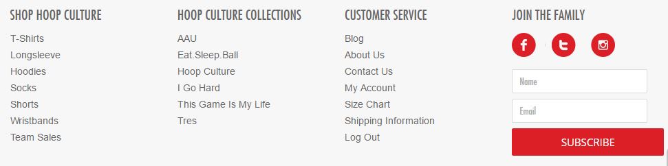
8. Bottom Navigation
When users have explored all the way to the bottom of your page, don’t forget to remind them where to go next! Give them options to contact you and check out your other products. It’s also more convenient than scrolling back up, especially if they’ve just looked through a more content-heavy page.
Did your business pass the test of quality? Check out the blogs below for more tips to optimize your website.


